skip to main |
skip to sidebar
 I stumbled across this imaginative and whimsical card publisher during my first trip to Bob Slate Stationary in Harvard Square, and now their merchandise has been popping up around Tübingen. German company Inkognito (don't worry, there's an English language option in the upper left corner) sells greeting cards, post cards, prints, and a variety of other fun things incorporating anthropomorphic animals and silly scenarios. A large number of artists design for the company, with each infusing a similar air of playfulness into their unique styles.
 Remember those adorable paintings and the pig lamp in Amelie's room that sighed over her lovelorn-ness? Those are totally sold by Inkognito.


 They're designed by Michael Sowa, a German artist who seems to be the company's most popular and prolific artist. He creates quixotic scenarios involving pudgy animals and familiar settings. I really like his surreal approach to cute things.
 There's also an extensive collection of postcards, something I am in the habit of collecting.
 My favorite is this one, currently hanging on my wall. In German the word for light bulb is "Glühbirne", literally "glowing pear". One of my favorite words, actually.
 At the Inkognito website, you can browse by artist for their impressively large roster or by product type, including greeting cards, office supplies, bookmarks, and books. I'm not sure what a "panorama file" is but I sure want this one:
 Here are some other designs that strike my fancy. Be sure to check it out for yourself! Aside from Bob Slate, I'm not sure where they're available in America, but you can order their merchandise online, or just enjoy the images on this here computer screen.


 Stuttgart is the closest large city to Tübingen, and an excellent source of art-related activities. While my friends dedicated their Saturday to a Beerfest-like celebration in the area or the Mercedes Museum, I made my way to the Kunstmuseum Stuttgart, which collects and exhibits modern art.
 Its gorgeous glass, cube-shaped building had captivated me weeks before during my first visit to the city.
 The interior view is even cooler. Though most of its space was dedicated to the large exhibition Three. The Triptych in Modern Art (which I'll be reviewing later), the museum has an excellent collection, with a focus on German artists.
 There's a small room devoted to Minimalism. White Weiss (1997) by Heinz Gappmayr was my favorite.


 I fell in love with Dieter Roth, of whom I had never heard before seeing his work here. He has a manic style and a range of materials and influence that I really enjoy. One room houses the series 2 times 5 BATS and 2 times 5 TROPHIES, both from 1978. Several of his pieces were also part of the Three exhibit.


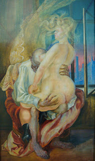

 They have a large number of Otto Dix pieces, with several rooms devoted specifically to him. I wasn't too familiar with him beforehand but after seeing his pieces here I really like him. He has an interesting, sketchy painting style and a penchant for drafting sickly, gruesome figures or creepy children. I am in full support of these tendencies.
 Homeless Person (1991) by Duane Hanson really caught me off guard. I definitely thought it was a real person as I walked in. It's a very bold piece.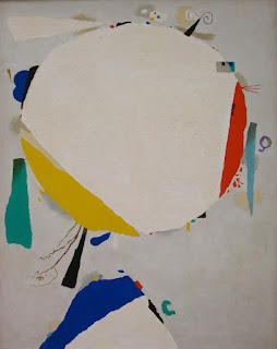
 There were some interesting abstract paintings and sculptures.
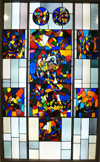 And a room for Adolf Hölzel and his experimental stained glass windows.
 There was also a great mini-exhibition for Stefan Burger, a young contemporary German artist. His Frischzelle_10 is quite imposing, with two paintings completely dominating the entirety of two walls. He has created a very theatrical setting, though devoid of human players. It had a wonderful feel to it.
 I was uneasy about Wolfgang Laib's Wax Room (1997) installation due to the small enclosed space, but I ended up kind of digging it. It's a short, one-ended hallway whose walls and ceiling are completely made out of wax. There was a very heavy but comforting smell and a soft light at the end. Quite interesting.
Here are a few other works that caught my eye:


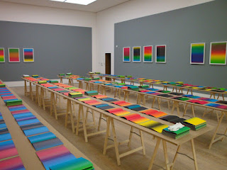
 I had a really great experience at the Kunstmuseum Stuttgart. It's a magnificent space, utilized to its fullest. It's open and bright, never feeling over-crowded. My biggest problem was the persistent use of glass over almost every painting. I understand this is important for conversation purposes, but it was often difficult to fully view a piece due to the reflection of light. That happens at a lot of museums, though, so it wasn't a big deal. I fully recommend this museum for anyone in the Stuttgart area. Review of the Three exhibition forthcoming!
 I traveled to Barcelona a few weeks ago, ready to marvel at its plentiful Gaudi architecture and picturesque beach landscape. I did those things, but my favorite part of the trip was a visit to the Museu d'Art Contemporani de Barcelona, a beautiful contemporary art museum. The building is bright and open, and very suited stylistically for forward-thinking newer artists. It doesn't have a large permanent collection, but has space enough to house several temporary exhibitions at once. While I was there three exhibits were on view:

Thomas Bayrle: I've a Feeling We're Not in Kansas Anymore
I wasn't a huge fan of German artist Thomas Bayrle. Most of his works incorporated repeated small images in an op-art style to create one unified image, often with a two- or three-tone color scheme. He also did several series relating to cars and highways. Much of his figural work was overly-pornographic. The pieces I liked most were his kinetic paintings, which involved string- or -rod-operated figures moving back and forth in wooden frames. I also enjoyed the room installation Jacke Wie Hose and M-Formation, with interlocked bits of brightly colored clothing repeated throughout a small room's walls, meeting with the M shapes sprawled across the floor. Otherwise, not much stuck out to me here.


 Rabascall: Production 1964-1982
I really enjoyed Joan Rabascall's exhibition, chronologically collecting a large number of collages, photographs, and mixed media works. A lot of his work involved tweaking advertisements or news articles to produce humorous composite images or ambiguous pictorial stories. As one might expect from of the 60's and 70's, many of the pieces lingered on photos of the sexualized female form, sometimes in a "women's bodies are exploited in advertising" way and sometimes in a "women of this age love being naked and free" way. Others spoke to the violent tendencies of the age as well as technological advancements.

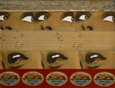
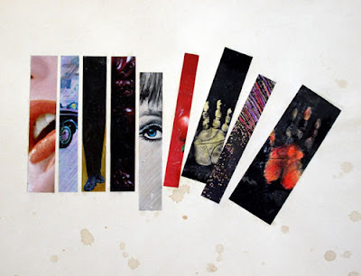
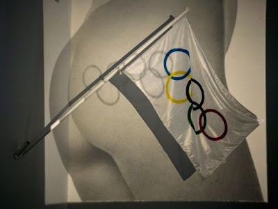 The second part of the show, featuring a large group of small collages from the "Spain is Different" series (1973-1977) as well as the politically-minded film Elecciones Show, was interesting but very much over my head. I admittedly know very little about Spanish history and could not fully appreciate these pieces due to my ignorance. Most of them fused idealistic tourism advertisements with the reality of its then-fascist government.
 Cildo Meireles
The third and final exhibition spotlighted contemporary Brazilian artist Cildo Meireles. His work is highly conceptual, resulting in large-scale installations and ambiguous sculptures, though several small drawings and objects were also shown. Eureka/Blindhotland (1970-75) is a room-sized space encompassed by black netting, with small, heavy balls covering the floor and a scale in the middle holding wooden shapes: two rectangles and an X, questioning if the two shapes are heavier separated or connected. Inside, it had an odd sense of quiet, and I felt somehow intrusive breaking the silence by clacking around several of the balls.
 Virtual Spaces: Corners filled an entire room with drawings of corners as well as a sculptural representation of them, highlighting his seeming obsession with the subject and furthering his examination of spatial constructs.
 Glovetrotter (1991) involved a mesh/chainmail-like material sprawled across one room's floor over several balls of different sizes and colors, creating a mini metallic landscape in which everything feels beyond reach.
 My favorite was Através (Through) (1983): I had to sign a waiver to enter! That alone made it the best experience of the day. It's a room-size installation with several levels of different kinds of barriers- fences, glass, barbed wire, shower curtains- and a layer of broken glass on the floor. In the middle of the maze-like setup is a large cellophane ball with a light emanating from within. The whole piece is a wonderful exploration of tactile surfaces and the different uses of transparent and translucent materials and their ability to be welcoming or upsetting. It was really interesting, and one of the few times I've been a part of a such a large-scale interactive piece.
Overall I really enjoyed this museum, and I hope I'll be able to go back again some time. Unfortunately these exhibits all ended shortly after I saw them, but I would recommend the Museu d'Art Contemporani de Barcelona to anyone visiting the city. Also, their store is phenomenal and very well-priced.
Check it out: Farel Dalrymple, one of my favorite comic book artists, did a short story entitled "Em and Gwen in: Magic Spell" for the Dark Horse Presents series run through Myspace. It's surreal, ambiguous, and stars precocious children, like most of the works I've read by him. The art is fantastic- his style is so dynamic and playful, with excellent attention to line. I'm not sure how I'm feeling the colors though (done by Jim Campbell). Nothing wrong with it, I just think I like his black and white stuff best. It's a bit more audacious, I guess.
 For more from this exceptional artist, he posts news and sketches fairly regularly to his livejournal, and both contributes to and edits the phenomenal Meathaus anthologies. He's also the guy who did art for the acclaimed Jonathan Lethem-penned Omega the Unknown revamp.
 And his solo graphic novel Pop Gun War ranks among my favorite comics (you know, the one that's the basis for my tattoo?). I'd recommend anything he's worked on for fans of imaginative, sort of weird, and really gorgeous comic books. Or anyone who trusts in my good taste!

 I stumbled across this imaginative and whimsical card publisher during my first trip to Bob Slate Stationary in Harvard Square, and now their merchandise has been popping up around Tübingen. German company Inkognito (don't worry, there's an English language option in the upper left corner) sells greeting cards, post cards, prints, and a variety of other fun things incorporating anthropomorphic animals and silly scenarios. A large number of artists design for the company, with each infusing a similar air of playfulness into their unique styles.
 Remember those adorable paintings and the pig lamp in Amelie's room that sighed over her lovelorn-ness? Those are totally sold by Inkognito.
 They're designed by Michael Sowa, a German artist who seems to be the company's most popular and prolific artist. He creates quixotic scenarios involving pudgy animals and familiar settings. I really like his surreal approach to cute things.
 There's also an extensive collection of postcards, something I am in the habit of collecting.
 My favorite is this one, currently hanging on my wall. In German the word for light bulb is "Glühbirne", literally "glowing pear". One of my favorite words, actually.
 Here are some other designs that strike my fancy. Be sure to check it out for yourself! Aside from Bob Slate, I'm not sure where they're available in America, but you can order their merchandise online, or just enjoy the images on this here computer screen.