skip to main |
skip to sidebar
 I went to Munich for a weekend and it was absolutely lovely- lots of Bavarian architecture and clothing, rolling hills and grand streets. Though I didn't have long, I was able to devote a Saturday morning to two of their main museums: Neue Pinakothek, which houses works from the 17th and 18th century, and the Pinakothek der Moderne, for the 1900's to present. I have to say I was much more impressed with the latter.
 Its building is lovely, with a lobby reminiscent of the Guggenheim but without the tiring uphill layout. Their collection covers many areas, from famed Modern and Contemporary painters to furniture design, from jewelry to architecture draftsmanship. Unfortunately I didn't have the time to see it all, and spent most of my visit in the Modern and Contemporary art section, waltzing quickly past the Ikea and Klaus Kinold exhibits after a brief look at the Zoe Leonard photo show (which I enjoyed, but don't have much to say about).
 First off was some superb Expressionism with several works from Kirchner, Schmitt-Rotluff, and the like. And maybe you'll remember: I really dig German Expressionism.


 I've noticed in the few museums I've so far visited in Germany, that there is a definite focus on showcasing German and Austrian artists. It's kind of cool. I'm accustomed to American museums, which usually don't lean toward a specific country representation unless it is significantly part of the museum's mission (ie the Whitney as a center for twentieth century American artists, etc). This way I am able to see a lot of German artists I hadn't heard of before, who perhaps hadn't become as successful outside of their native country, as well as a wider selection from German artists I already knew about. Which all adds up to: Learning!
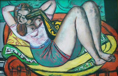
 Max Beckmann had his own gallery, which I adored. Included were several self-portraits, a piece (Woman with Mandolin) I've seen in the Busch-Reisinger Museum at Harvard (though maybe it was just on loan?), and a triptych (in case you haven't seen enough already).

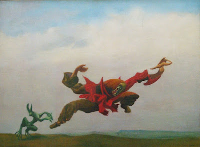
 There was a small collection of Surrealist works. I liked the Max Ernst pieces- he's an artist I know about, and whose importance I understand, yet I have only seen a small portion of his pieces.


 George Baselitz had a small exhibition in one room. Large-scale, textured paintings combining abstract brush strokes with representative figures, all of them vaguely menacing. I will keep an eye out for more of his work.

 One room was filled with Sigmar Polke's series 8 Loop Images, so I was a happy camper. Gorgeous abstract images combining delicate calligraphy-like scribbles and sandy backgrounds. A wonderful exploration of layering and texture. I am constantly impressed with how varied and extensive Polke's talents are. He can never be pigeonholed into one medium, technique, or movement. Awesome.


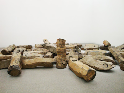
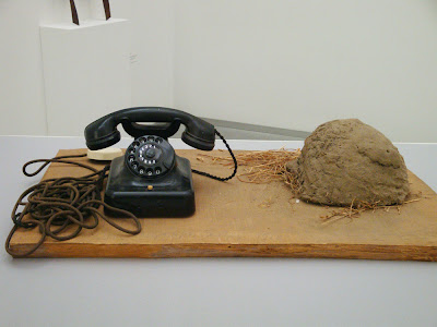
 Lots of Joseph Beuys objects, as well as the chilling room-size installation The End of the 20th Century, composed of large, scattered basalt structures resembling ruins. It's hard to describe without being there, but it had this unearthly calm and quiet that I found very affecting. I really dig Beuys for his weirdness and boundless imagination. I would have loved to see one of his performances. Also check out this cute Warhol portrait. He looks so befuddled.

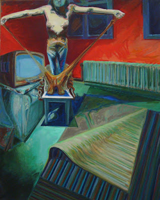
 Discovered contemporary German artist Norbert Tadeusz in one gallery. Interesting works: mostly ambiguous nudes in dimly-lit rooms, with off-kilter compositions and angles. I loved some, while others didn't move me much. His attention to shadow gives an eerie, compelling mood to his paintings, but sometimes I was thrown off by his color choices.
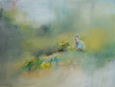
 Small room dedicated to Jochen Klein, another new German artist to me. I really, really enjoyed his paintings. They are small, figural scenes in abstract nature settings. The figures are detailed and emotional, surrounded by incredibly soft, blurred brushstrokes. Everything is so light and subtle, and just really beautiful, but with a slight uncanny air. Unfortunately Klein, who was diagnosed with AIDS, passed away in 1997 at only 30 years of age.


 Light art, yay! No Turrell, though, which is always too bad. Nothing wrong with Flaving, I just like Turrell better. I find his works much more emotional.

 I really enjoyed the Pinakothek der Moderne, and I only saw 1/4 of its contents! It's well-organized, beautifully designed, and features an impressive collection of modern and contemporary artists. Highly recommended to anyone visiting Munich.
 I'm going to Istanbul for the weekend! Expect photographic explorations of the Hagia Sophia and other wonders when I get back, as well as more artsy things I've been doing in Germany.
(image by Sam Brown at explodingdog)
 My visit to Stuttgart's modern art museum led me to the exhibition Three. The Triptych in Modern Art. I was blown away. It's an incredibly interesting theme, and one I had never seen explored before.
In case you didn't know, a triptych is an artwork divided into three parts, sometimes separated and sometimes connected. It became a staple in Christian art during the Middle Ages and Renaissance, often designed as altar pieces. Many of them resemble this. Since then the format has shed its religious trappings and has been used by modern and contemporary artists for portraits, abstract pieces, political commentary, video installations, and really any subject they wish to represent.Spread throughout all five floors of the magnificent cube-shaped glass building, the exhibition features a large amount of paintings, along with some video, mixed media, and pastel works. The bulk are from German artists, but there are several recognizable American and European artists in there as well. It covers a wide range of subjects, techniques, and movements, with each room loosely organized by theme.
There are multiple rooms for works dedicated to war and politics, with large-scale triptychs mourning cataclysmic battle scenes and acts of terrorism. Some of my favorites:
 Katharina Sieverding: Steigbild X (1997). The large size and simple but bold composition make for a really striking piece. Its message is universal and easy to read, without being too pushy
.

 Joe Coleman: War Triptych (2003). This one is small but incredibly complex, wasting no space in its depiction of a world gone mad with brutality and fear.
 Robert Longo: The Haunting (2005). A more subtle execution of a triptych, this piece merges both twin towers into one black looming form with a nearby plane on either side. The domination of the black space speaks to the towers' intimidating size and power, making it seem impossible for such small planes to destroy them.
 Markus Luepertz: Black-Red-Gold I-II-III (1974). Three portraits of a seemingly bodiless soldier, clad in dark armor in a dirty golden landscape, stained sporadically with red splotches. At first glance they seem identical, but each was clearly painted separately and therefore shifts subtly from one to two to three. They are the same and yet still strive to be distinguishable from one another. Black, red, and gold are the colors of the German flag.

 Willi Sitte: Hell Fall in Vietnam (1966). That's a literal translation, sorry but I'm not sure if "Höllensturz" has another meaning. This is a large and chaotic work, heavy with war imagery. I love the light and layered brushstrokes and incredible expression.Otto Dix and Max Beckmann got their own room, a testament to their importance in modern German art.

 Otto Dix: Metropolis (1927/28). Of course Dix, the museum's favorite artist, stands out with this memorable triptych, no doubt intended to shock the wealthy public into taking a more proactive stance for veterans of WWI. Pale, overly-made-up women slink their way in and around a jazz club with colorful furs and snobbish expressions. They glide easily past the grungy, handicapped ex-soldiers haunting the alleys near the club, faceless in the painting as they surely appear faceless to the ignorant partygoers around them.
 Max Beckmann: Beginning (1949). I really like Max Beckmann. He is one of those artists whom I have written about for a class, and therefore somehow feel a personal connection to. This piece is part of a series of triptychs he did toward the end of his career. With the reminiscence of a dream on the left, and school memories on the right, the middle panel combines the two into an ambiguous fantasy and a kind of memoir.
There were several Dieter Roth pieces, in which his range of media and subject was apparent. He's quickly becoming one of my new favorite German artists after my exposure to him here.
 Dieter Roth: Baroque (Acting) (1977). Several of his triptychs took the form of a middle piece with hinged side pieces, able to open and close. I really like that concept- it makes me think of doors or boxes or something that can be hidden. This one is his most abstract in the exhibition, with a lovely mix of color, form, and medium. The many layers create a sense of depth and complexity.

 Dieter Roth: Interfaces (with Richard Hamilton) (1977-78). Definitely my favorite. A set of double portraits of the artists, one a photo and one a drawing. It's playful and imaginative and kind of adorable. I like when artists remember that it's ok to be lighthearted in art. Not everything has to make a statement. Plus, teaming up with Richard Hamilton? Awesome.
 Dieter Roth: Unfinished Checkered Picture with Window (with Björn Roth) (1981). A work about creating the work. Interesting.
 I was so happy to see Francis Bacon here! When I saw the theme of the exhibition I immediately thought of his triptych I had seen at Tate Modern, but I usually don't see too many Bacon works in museums so it's never something I expect. Above is Three Studies of George Dyer (1969), a wonderfully fragmented portrait of the artist's lover. I'm so enamored of his style.
 Gerhard Richter's Studio (1985) is easily one of my favorite pieces in the exhibition. So, so eye-catchingly beautiful. It is packed with feeling, color, and spirit. I don't need to know the message or intent behind it, because to me it's just marvelous to look at. Currently my computer's background, actually.
There were a few more recent pieces that caught my eye, situated in the "Between Surrealism and Spirituality" room.
 Sigmar Polke: Apparition (1-3) (1992). I've been studying Polke in a class I'm currently taking (German Art, 1968-Present) and I'm liking him more and more. This is quite an imposing abstract piece, with each panel invoking different images and emotions. I really like the right panel, packed as it is with markers of a powerful sunrise. The left panel is dimmer and somehow monstrous. I like the middle, but I'm not sure why. Its three-quarters of a rectangle seem to indicate an interior space, or perhaps a frame within a frame. You can't really tell, but the entire piece is done on some sort of triangle-patterned material, similar to a wooden floor design. Gives it a nice texture.


 Jonathan Meese: ARCH BALLET SCHOOL "SALOON FITTY" (The Grave-Fresh GYMNASTICS of the Total BABY METABOLISM Underpants Revolution "NOT-I") (2009). Yeah, ok I translated that myself (with much help from a German dictionary) and I am completely unsure as to its accuracy. Sorry. Anyway Meese is an interesting character. So far I've concluded he's kind of a stuck-up ass, but maybe I like some of his art? This piece I enjoy, despite its heavy-handed commentary/directions on What Art Is. Visually it's complicated and engrossing, plus it's absolutely huge, taking up the entire wall upon which it is hung. There's a wide array of media, from underwear to pornographic magazine clippings to Euro bills to fans to dictator trading cards. He reminds us that "Art does not equal Culture" and "Art is not a religion, but all religion is art", etc. The painted aspects are childish and graphic, with various monstrous figures interacting with their nearby objects.
Three. The Triptych in Modern Art runs until June 14 at the Kunstmuseum Stuttgart. I highly recommend it to anyone who happens to be in the area! Also, for more pictures of the exhibition check out 8mobili's flickr set "cube".
 I went to Munich for a weekend and it was absolutely lovely- lots of Bavarian architecture and clothing, rolling hills and grand streets. Though I didn't have long, I was able to devote a Saturday morning to two of their main museums: Neue Pinakothek, which houses works from the 17th and 18th century, and the Pinakothek der Moderne, for the 1900's to present. I have to say I was much more impressed with the latter.
 Its building is lovely, with a lobby reminiscent of the Guggenheim but without the tiring uphill layout. Their collection covers many areas, from famed Modern and Contemporary painters to furniture design, from jewelry to architecture draftsmanship. Unfortunately I didn't have the time to see it all, and spent most of my visit in the Modern and Contemporary art section, waltzing quickly past the Ikea and Klaus Kinold exhibits after a brief look at the Zoe Leonard photo show (which I enjoyed, but don't have much to say about).
 First off was some superb Expressionism with several works from Kirchner, Schmitt-Rotluff, and the like. And maybe you'll remember: I really dig German Expressionism.

 I've noticed in the few museums I've so far visited in Germany, that there is a definite focus on showcasing German and Austrian artists. It's kind of cool. I'm accustomed to American museums, which usually don't lean toward a specific country representation unless it is significantly part of the museum's mission (ie the Whitney as a center for twentieth century American artists, etc). This way I am able to see a lot of German artists I hadn't heard of before, who perhaps hadn't become as successful outside of their native country, as well as a wider selection from German artists I already knew about. Which all adds up to: Learning!
 Max Beckmann had his own gallery, which I adored. Included were several self-portraits, a piece (Woman with Mandolin) I've seen in the Busch-Reisinger Museum at Harvard (though maybe it was just on loan?), and a triptych (in case you haven't seen enough already).

 There was a small collection of Surrealist works. I liked the Max Ernst pieces- he's an artist I know about, and whose importance I understand, yet I have only seen a small portion of his pieces.


 George Baselitz had a small exhibition in one room. Large-scale, textured paintings combining abstract brush strokes with representative figures, all of them vaguely menacing. I will keep an eye out for more of his work.
 One room was filled with Sigmar Polke's series 8 Loop Images, so I was a happy camper. Gorgeous abstract images combining delicate calligraphy-like scribbles and sandy backgrounds. A wonderful exploration of layering and texture. I am constantly impressed with how varied and extensive Polke's talents are. He can never be pigeonholed into one medium, technique, or movement. Awesome.

 Lots of Joseph Beuys objects, as well as the chilling room-size installation The End of the 20th Century, composed of large, scattered basalt structures resembling ruins. It's hard to describe without being there, but it had this unearthly calm and quiet that I found very affecting. I really dig Beuys for his weirdness and boundless imagination. I would have loved to see one of his performances. Also check out this cute Warhol portrait. He looks so befuddled.

 Discovered contemporary German artist Norbert Tadeusz in one gallery. Interesting works: mostly ambiguous nudes in dimly-lit rooms, with off-kilter compositions and angles. I loved some, while others didn't move me much. His attention to shadow gives an eerie, compelling mood to his paintings, but sometimes I was thrown off by his color choices.
 Small room dedicated to Jochen Klein, another new German artist to me. I really, really enjoyed his paintings. They are small, figural scenes in abstract nature settings. The figures are detailed and emotional, surrounded by incredibly soft, blurred brushstrokes. Everything is so light and subtle, and just really beautiful, but with a slight uncanny air. Unfortunately Klein, who was diagnosed with AIDS, passed away in 1997 at only 30 years of age.


 Light art, yay! No Turrell, though, which is always too bad. Nothing wrong with Flaving, I just like Turrell better. I find his works much more emotional.
 I really enjoyed the Pinakothek der Moderne, and I only saw 1/4 of its contents! It's well-organized, beautifully designed, and features an impressive collection of modern and contemporary artists. Highly recommended to anyone visiting Munich.


